Triesch Residence - A Colorful Challenge by Elena and Paolo Brasioli (Quattro Architectura)
The development of a color board is always a project at the heart of every architectural work.
In the case of the Triesch Residence, however, it was a special Challenge:
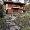
It is one thing to create a color board for a self-designed home – but truly something else for the first and only house in Europe designed by the wonderful, visionary architect Ray Kappe.
Being able to create the color palette for this particular residence was one of the greatest challenges we had ever faced. Our objectives were of course on the one hand, to respect the legacy of the late Ray Kappe and the Inherited legacy which his sons carry forward, while simultaneously, on the other hand, the wishes of all members of the Triesch family.
So, we started with the most obvious: an inventory.
According to our usual approach, we asked all members of the Triesch family to select two favorites from a color fan (Fig. 1).

Next, we looked closely at the colors used by Ray Kappe. We were very lucky here, because in addition to the published photos, Mr. Triesch had an extensive photo library from his travels to America and visits to built Kappe houses. Still, we wanted to be sure with the color values extrapolated from these personal and press photos. So, Mr. Triesch organized an HKS color scanner that, as a little surprise, made its way across the Atlantic and found itself in the hands of Finn Kappe, who enthusiastically recorded and archived all the colors used in the Kappe residence.
And so, a second basis from which to approach the color board was created, in the context of the general colors chosen by Ray Kappe and used in his built works (Fig. 2).

At the same time, Ditzler Color Company created and released a Williamsburg color collection with 42 shades for the automotive industry. After, among others, Martin-Senour Paints would offer a Williamsburg collection with 184 colors up until 2013 (Fig. 4), and as recently as 2017 Benjamin Moore presented “The Williamsburg Color Collection” with 144 colors
Link:„The Williamsburg Color Collection“
We came full circle after studying the Frank Lloyd Wright color collections, which is also the most recent addition to the diverse American Historical Form color palettes.
„Go to the woods and fields for color schemes. Use the soft, warm, optimistic tones
of earths and autumn leaves.“ Frank Lloyd Wright.
Frank Lloyd Wright advocated, among others, the principle that a building should appear as though it had grown out of its surroundings - it should harmonize with the environment.
And vice versa, the color spectrum of the surrounding nature should harmoniously match the materials of the house – Sunlight, the trees, stones and water formed the primary source of the colors used by Wright. The materials, their surface structure and color, should in turn remain unadulterated – wood should look like wood and bricks like bricks.
Fallingwater, designed by Frank Lloyd Wright in 1935, reflects these principles. The materials used outside the building were also used in the Interior and continued seamlessly throughout, to create a neutral color palette of gray and pink ocher tones.
In the interior he chose earthy warm red, gold, brown and green-yellow tones. "Cherokee Red" was his personal favorite and was used exclusively for the metal and iron work on the "Fallingwater" project. In his opinion, this color could best reflect the nature of the material steel, while protecting it from the elements. Similarly, different colors were used for the floors and chosen in accordance with the color variety found in the natural stones of the area. The Color palette includes white, raw umber, burnt umber, black, gray, and Yellow-brown. The overarching theme reflects the landscape with its native trees and stones.
Wright followed a similar concept when choosing the color for his winter home, Taliesin West in the Arizona desert. Here too, the chosen Colors as well as the building materials, such as the concrete with its large aggregates and the steel, reflect the natural environment.
To make it possible for the general public to access colors Frank Lloyd Wright used in his many projects, the aforementioned company “Martin-Senour Paints” decided to offer the “Taliesin West color collection” in 1955. For this collection Wright personally chose 36 colors from their existing Color portfolio which best reflected colors used at Taliesin-West
Link: „Taliesin West-Color-Collection“
In collaboration with the private nonprofit organization; Western Pennsylvania Conservancy, to whom Edgar j. Kaufmann Jr. donated the Fallingwater property and house, a thorough color analysis was done and a color collection consisting of 13 shades was brought to market. And as recently as 2007, Paint manufacturer PPG Paints (Pittsburgh Paints Company) would release “The Fallingwater color collection”
Link: "Fallingwater-Color-Collection"
In 2014, PGG also acquired the "Taliesin West- Color Collection” from Martin-Senour Paints, and In cooperation with the Frank Lloyd Wright Foundation created a new and revised version “The Original Taliesin Color Palette from 1955 “.
Link: „The Original Taliesin Color Palette from 1955"
Upon inspection of the colors that were among the favorites of the Triesch family, the preferred colors of Ray Kappe, and the color collections of Frank Lloyd Wright, an overlap emerges almost imperceptibly. A clear focus on natural colors from each project’s surroundings, which when applied accordingly with the materials chosen for the house, explore harmony.
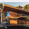
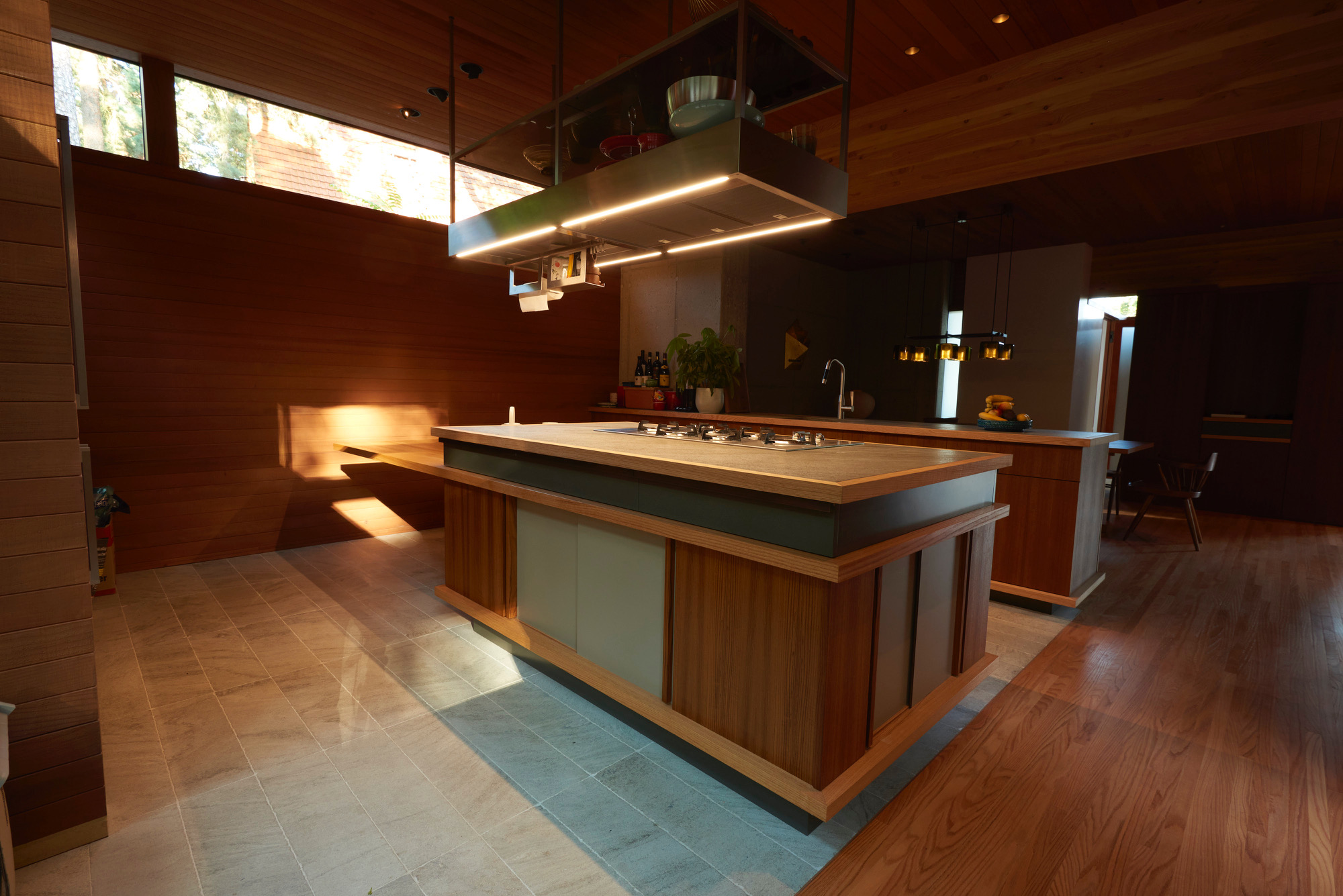
However, another aspect was also decisive: the complexity and many layers of Ray Kappe’s design in the Triesch Residence. the Interplay of the concrete pylons with their skylights, the central patio as horizontal and vertical link of the house, the stairs and the fireplace on the Ground floor as vertical connecting elements, as well as the visible space-forming Construction details which create a lighting scenario that changes every minute with light and shadow.
In addition, and by no means less important, the materials used are each strong Protagonists:
∙ Sandblasted concrete for the stiffening concrete pylons
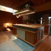
∙ Douglas fir for the main beams and window / door leaves
∙ Iroko for the window frame elements and surrounding light strips in the Indoor
∙ Redwood for the wall cladding
∙ Red oak for the parquet floors and stairs
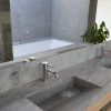
∙ Corian for the interior wall sections cladding in the Parapet corner areas
∙ Rauriser for the stone floors.
Each material is characterized by its individual structure and color, but in the context of the play of light and shadow. While equally important to be self-sufficient and selecting demarcating shades for the furniture, upholstery, and textiles that stand out, would be an option, it was important to not enter into a competition with the building materials. But rather accomplish an outcome characterized and accentuated by elegant restraint.
Because of the connectedness of the flowing vertical and horizontal lines, Rooms, as well as the visual references, insights and outlooks made possible by them, our color concept applies to all rooms as a superordinate design element. Each element fits together, and so, colors can also be used across rooms throughout the House.
For the Triesch Residence we chose the following protagonists from the repertoire of the oldest colors on earth – all combinations can be made from these colors, with the chalk white acting as the basic color (Fig. 3):

- Red lead
- Chrysocolla
- Lapis lazuli
- Lead tin yellow (Giallolino)
- ocher
- Chalk white
- Lamp black and
- Egyptian blue
The fresco “The Triumph of Galatea” by Raphael, Villa Farnesina, Rome, Italy (Fig. 4) combines these in a wonderful way.